
Book cover design has long been an important part of getting readers to pick up a book. Now that readers are shopping for both physical books and eBooks online, book cover design is more important than ever.
Readers click through countless options and offers. A good cover can be the difference between a reader stopping to check out your description, or clicking on to the next page without stopping. Getting a reader’s attention with your cover is one of the first steps in getting someone to read your book.
Think about your book cover as an advertisement. It’s the most widely used piece of advertising creative you will have. And it’s important to invest in.
In this post, we’ll outline the five most common mistakes in book cover design and how to avoid them. These tips can help you whether you are creating you own cover with a program like Canva, or working with a designer. When you work with a cover designer, keep these tips in mind and make sure you give them creative direction that won’t force them to make the mistakes below.
1. Too many elements on the cover
This is an all too common mistake, particularly with inexperienced designers. It’s common to feel the need to fit multiple elements of your plot on the cover to give it a more descriptive feel. It’s also common to see covers with all main characters depicted to give readers a better idea of what they look like.
Here are the big problems with overloading a cover with story elements:
- It’s confusing, the reader isn’t going to know which element is most important.
- Book covers are shown as rows of tiny thumbnail images on most retail sites like Amazon. There simply isn’t enough space on that tiny thumbnail to communicate much.
- As a rule of thumb, one beautiful element that tells part of the story is almost always better than lots of small elements.
The desire to have a cover describe a book comes from a good place of care for the reader. But, unfortunately, such book covers will likely only be appreciated by readers after they have read the work. Without context, a mish-mash of elements can seem overwhelming and can turn a reader off.
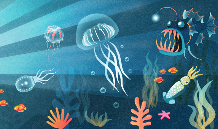
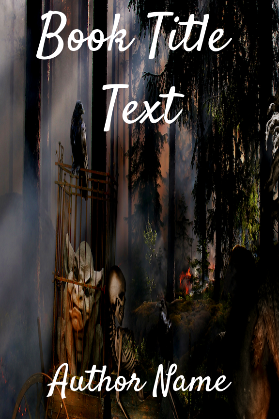
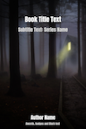
Take a look at the example cover below. The style is in the Cozy Mystery vein, but it has tried to put every aspect of the plot on the cover. Yes, it’s interesting to imagine how the author will weave all of these objects together, but that requires a lot of thought.
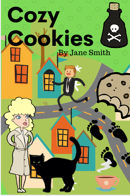
A reader is making split second decisions about which book to buy. At first thought, this cover is confusing and overwhelming. A well-designed cover will draw a reader’s interest right away, not after studying it like a famous painting.
This cover also doesn’t utilize blank space, which is an extremely powerful design concept. Inexperienced designers will often shy away from leaving any space unused on a cover. But, in reality, having well placed blank space draws attention even more to key elements. If you notice your cover designer has left blank space on your cover, resist the urge to tell them to fill the space with stuff.
A great example of picking few elements and using blank space is Joanne Fluke’s cover for “Banana Cream Pie Murder.”
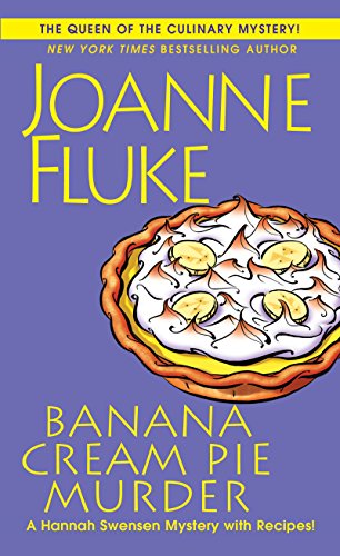
This cover leaves some room to breath in the middle, which draws the eye to the few main visual elements. It is easy for a reader to see and understand everything on this cover with a quick glance.
Many book cover designers will ask you to fill out a form with information about what you the author want on the cover, make sure to give them the feedback that you don’t want too many elements.
2. Not a genre fit
This is a big one. Different genres have developed distinct differences in how book covers are designed. If your book cover does not share these stylistic similarities, readers interested in that genre will pass because it doesn’t look like other books they have enjoyed.
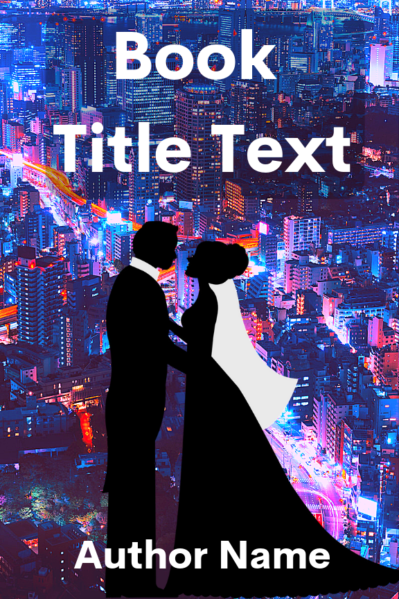
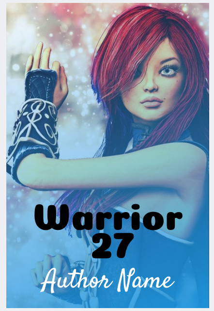
This book cover is confusing. It has a lot of futuristic science fiction style colors in the background, but the overlay, while it does a good job of creating focus on a single element, doesn’t fulfill what we expect. Is this a science fiction book? Is it a romance? Is it both? The fact that we can’t instantly say for sure is a problem. If this book is a romance novel set in a city, this cover isn’t what readers of urban contemporary romance have come to expect.
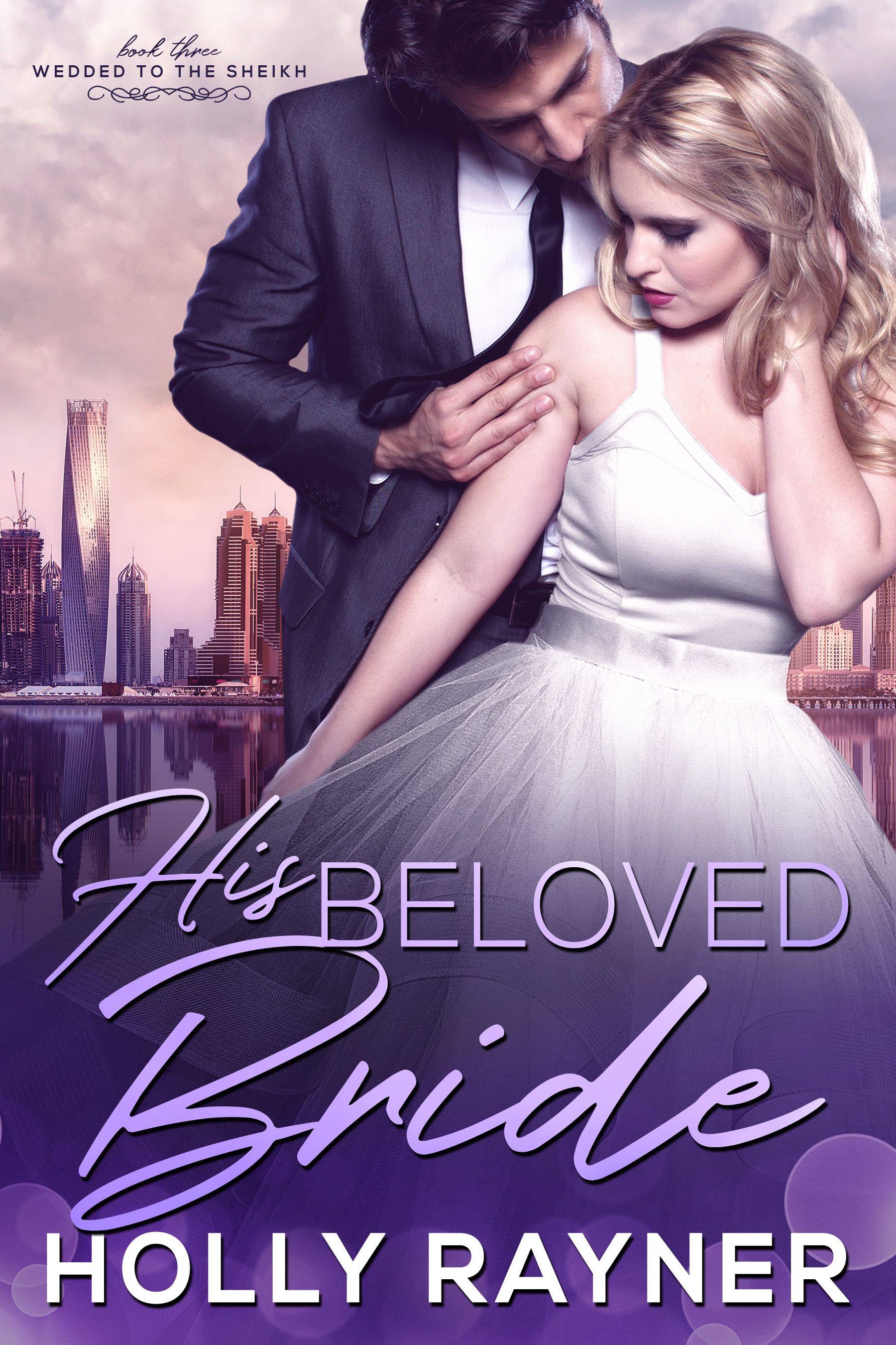
Holly Rayner has a much better cover on this book. We have a lot of similar elements, but the color scheme of the background is more in-line with the romance genre. Deep purples and no neon tell the reader “this is a romance book.”
Remember, you only have a split second to make an impression with your cover. Most readers know their favorite genres and what those covers look like. If your cover does not look like your genre, you can miss out on readers who would love what you have written. Or, get readers who expected something else based on your cover.
3. Poor or wrong font choices
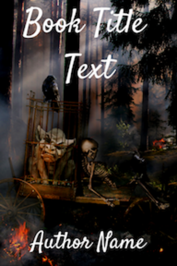
Once again, it’s all about signaling to readers what your book offers. Your font should be similar to other covers in your genre. Take a look at the fantasy book cover example below.
We’ve got a classic fantasy style image, but the font? Not so much. It’s cheerfully handwritten with flourishes that would be much more at home on a chick lit or teen romance novel. This font makes this cover feel a lot lighter. You almost wonder if it’s a goofy tale about a spunky goblin navigating a difficult world of classic fantasy tropes.
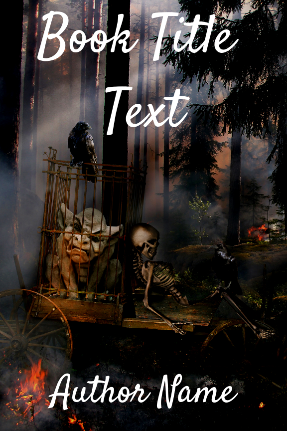
Here, Stuart Thaman’s book cover design uses a much more appropriate font.

Serif fonts are often used for fantasy covers, and the medieval look fits perfectly with the genre. The font used here looks like it could have been pulled from the detailed handwriting of an ancient monk who transcribed this tale.
Take a look at bestsellers in your genre when choosing a font. You don’t have to use the exact font others are, but use something that is similar enough that readers won’t be thrown by it. Generally a decent cover designer will use appropriate fonts, but be careful not to ask for a specific font if it’s off-genre.
4. Poor image quality
This is an easy mistake to make if you are new to book cover design, and it’s important to be able to spot it in case you work with an inexperienced designer.
When you use an image on a cover, be careful if you find you need to enlarge it at any point. Small images will decrease in quality as they are stretched to fill space. Looking at the cover below on the left, you can tell that the text is fuzzy, and the detail of the image is blurred.
Additionally, be careful if you want to change the dimensions of an image. If you are using Amazon’s recommended cover dimensions (2,560 by 1,600 pixels), and your background image is much wider at 2,560 by 2,600 pixels, you should crop the image to get rid of the extra width.
Some programs will allow you to simply drag the image smaller, and create a smushed version of the original. See the example below.
As you can see, the image on the left was squished in order to fit the required width. The image on right was simply cropped, and avoids having to smush a wide image into a narrow cover.
This is a pretty drastic example. It’s easy for this to happen in a more minor way without it being obvious. We recommend checking your final cover against the original background image to make sure things look they way they should. As the author you will likely get a cover image that is the correct aspect ratio, but be careful when you upload it to your website or use it for other purposes.
5. Poor readability
Today, book covers are displayed by vendors in a number of sizes and formats. Almost always, readers will see your cover at a size much smaller than a physical book cover.
This means that it’s vitally important that your cover be legible when it is shrunk down and put in a list of books.
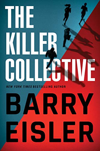
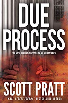
In the examples below, Barry Eisler and Scott Pratt both have designs with massive text dominating their covers. Compare the three covers below. The text on the book cover to the left is still legible, but you have to really strain to see it. Readers will be drawn to a cover they can easily understand when scrolling through a list of books. A good practice is to look at your book cover as a thumbnail. Often when a designer sends you a book cover, you look at it in large format on your computer. Shrink it down to thumbnail size to make sure it’s going to look good on retail sites.
Another aspect to consider is that not everyone’s eyesight is the same. If you use a cover like the one on the left, it may end up looking like the example below to some readers.
Need more resources on book cover design?
As we’ve discussed in this post, it’s vital that authors get their book cover right. Because of this, we want to provide you with as much information as possible to help you make the right cover decisions. If you’d like more resources on this topic, check out our other posts below:
Three Big Mistakes to Avoid When Designing a Book Cover
How to Find and Work with a Book Cover Designer
How to Create a Best-Selling Cover
Takeaways
Book cover design is critical to a book’s success, and there is a lot more to consider than you might expect. Keep in mind these mistakes when working on your next cover, and you’ll be more likely to produce an attractive cover that drives sales.
Also, remember that you can always change the cover on your eBooks. Have a cover you think might be hurting your sales? Swap it out for a new one and compare your numbers,
Do you have any cover design tips or stories? Let us know in the comments.
Note: this post was updated on 5/17/2024
I task the artist I commission to draws my covers to follow the following guidelines–unless something else need be considered.
1. An image of the protagonist or the antagonist is the central point of interest.
2. All factors considered, the body mass of this image is placed in one of the four corners as defined by the Rule of Thirds.
3. Other elements in the scene project leading lines toward the central image.
4. The other elements in the cover mimic the mise en scene of the narrative.
5. Often times, I use custom designed fonts for cover text. Such fonts are native to the background of the story.
I ma researching book covers in the process of creating my own. I see many books that state – written by _____ or by____ and some simply state the authors name as a stand alone. Which is better to use and why?
Thank you!
Um. Great article, and I have posted it to my Facebook writers’ group. But “eye site”?
Thanks Julia, we’ve fixed that.
Post says: “You almost wonder if it’s a goofy tail about a spunky goblin…”
Do you mean “goofy tale”?
Yes, good catch. We’ve updated it!
Thank you! I just re edited my trilogy in about to do all new covers. Two years ago when I wrote the books I was so excited I hired book cover designer. I thought it was great but now when I look back at them I’m not happy the fonts are all off the characters look cheesy. This is giving me such better insight thank you.
Thanks Diana! I’m glad you found this helpful.
Interesting. I really REALLY liked that first cover you use as an example of “Too Many Elements”. It intrigued me, and I wanted to see more, so I zoomed in and took it all in. I might even go so far as to say it’s my favourite cover in the whole article!
Great post!
I also think so.
Very true. Many people don’t think about matching the genre but literary or non-genre fiction has more leeway. For instance, of the three ‘Poor Readability’ examples I immediately turned my eyes away from the two with the massive font because I know they’re just not for me and was more drawn to the ‘less is more’ one on the left. I would make an effort to look at the smaller font if there’s something more intriguing or drawing me in about the cover. Obviously it needs to be large enough to see it, especially due to the size of thumbnails as you say.
That’s a great point, Kate. I learned a lot about what I look for in covers while writing this article. Just being more aware of what catches my eye and why was fascinating. It’s all about signaling to readers, and matching the cover to the genre is the best way to do it. It’s just not always as easy as it sounds.
I’m struck by how poor the covers tend to be on books by best- selling authors In the crime and legal genre. The publishers seem to put out little effort and expense despite the fact they make millions off these authors. Apparently they think the author’s name alone will sell the book. I wonder why these authors don’t demand better. As for the rest of us, good covers are a must and the advice is right on target.
Beautiful article from you, its always nice seeing that there are different ways we can improve our books. I also want to add that the creative content is even more important than the cover. In my opinion, the children’s book series, Pete the Cat, became successful because of the quality of the written contents, not really the cover pages of the book which in my opinion is not the best of all. The book is so successful that it has been adopted as an Amazon original kids show. Great job once again!
Pretty much the same “rules” apply to interior decorating.
If you give a room too much (accessories, furniture, art work, over crowding in general, etc.), there’s no place for the eye to rest. If you try to incorporate too many styles, the people in the room most likely will feel uncomfortable and confused. If you use too many colors…same thing.
Maybe I should design book covers. 😉
On the topic of thumbnail size, Goodreads displays book covers at 75 pixels high. It’s worth shrinking the image to see how it looks at that size.
Very useful points you have mentioned. Do you have any tips for social media graphics? Please share if any.
As a bookseller, placing any book on display, or even on the shelf with only the spine showing if it uses dark colors or BLACK, especially without contrasting text, and if it has a bad font for the title and author’s name, will almost certainly make it undesirable for customers to peruse – unless it is an in demand, hot new release.
That said, flowery pastels and often earth tones, when mimicking the style of other books or genres – while an obvious marketing ploy – seem to be a rip-off to me. In fiction, originality is my desired reading and the cover sets the tone for that.
Excellent info, and I’ve signed up for the newsletter. As I represent several repeat authors, I’m happy to be able to show them this article and succeeding ones. Obviously, it’ll help my newer clients too.
Do you have any thoughts on the spine of the books? I ask because many of us like to read books by the same authors, and library books almost always have a label affixed to the spine low down, where the author’s name too often is. Even bookstores often put a label at the bottom!
For me, it would be great to see the author’s name at the top, so I’d know who wrote it!
I suppose a book cover should arouse curiosity?
Much like garden design. Perhaps a meandering path with an object of intrest at the far end.Which you can’t discern what it is,but have formed an opinion on what it might be.
“I will have to go and have a sticky beak to satisfy my idle curiosity.”
To be really honest, I was looking for this type of article and you have covered up the things quite nicely. Thanks for sharing with us.
Thank you for putting this out there. I agree with your opinion and I hope more people would come to agree with this as well.
I’ve just read your article. I found it to be very easy to follow and the suggestions were very logical. I also enjoyed the comments that were posted. Thank you to you all. Very helpful.