

2.89 billion users.
That’s how many people scroll through Facebook on a monthly basis. 🤯 As a marketing-minded author, you may be thinking about all the potential readers to be reached out of 2.89 billion sets of eyes. We had the same thought, prompting our complete guide to Facebook Ads to be written.
If you’ve read the guide, you likely remember us saying that Facebook is a successful method for authors to discover new readers, sell more books, and build their community. When authors utilize Facebook Ads, their reach grows even more.
What are Facebook Ads?
Facebook Ads target specified audiences so that products can be placed in front of the people most likely to buy them. There’s a strategy to this approach, though. Paid promotions are more successful with carefully chosen imagery and text.
If you need a refresher on how to get started with Facebook Ads, we suggest returning to our guide to look at Ad structure and how to get campaigns set up. From there, you’ll be ready to design a successful image – also referred to as “Media” on the Facebook Ads platform.
What Makes a Good Image for Facebook Ads?
The most effective way to determine what really works on a Facebook Ad is to analyze the results of campaigns you’ve already run. But on a much broader scale, we’ve found that successful Facebook Ads for authors have a few commonalities.
Successful copy (this is the text that shows up in and around your Ad) tends to be:
- Concise and clear.
- Completely relevant to your book.
- Tied directly to your book’s value proposition.
Successful graphic design (this is the image that is created for the Ad) tends to be:
- High quality.
- Not overly crowded (stay away from busy patterns!)
- On-genre so readers know what they’re getting.
Check out a sample Ad we created:
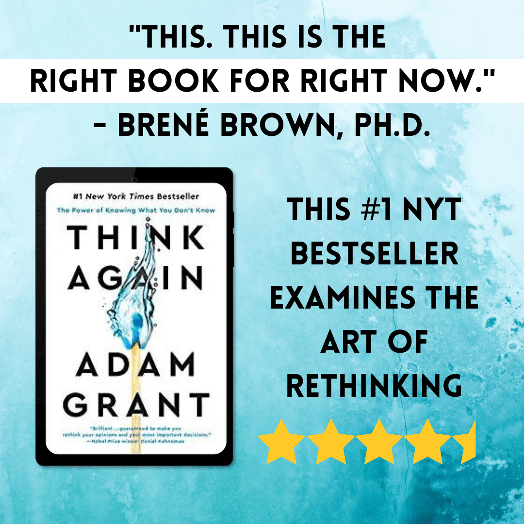
What makes this ad successful is that:
- It’s eye-catching with the alternating blue background and gold stars.
- It features a high-profile quote from Brené Brown, which can prove legitimacy to new readers and show why they should buy it… “If Brené Brown loved it, I will too!”
- It has a brief summary of what the book’s subject is (the art of rethinking).
- The attractive book cover is displayed in a high-resolution image.
Keep reading our article to see sample Ad templates in five of the most popular reader genres. We’ll even give you downloadable links to duplicate our designs in the book marketing tool Canva!
- Mystery Facebook Ad Image
- Romance Facebook Ad Image
- Science Fiction Facebook Ad Image
- Fantasy/Paranormal Facebook Ad Image
- Literary Fiction Facebook Ad Image
- Wrapping Up: Facebook Ad Images for Authors
Mystery Facebook Ad Image
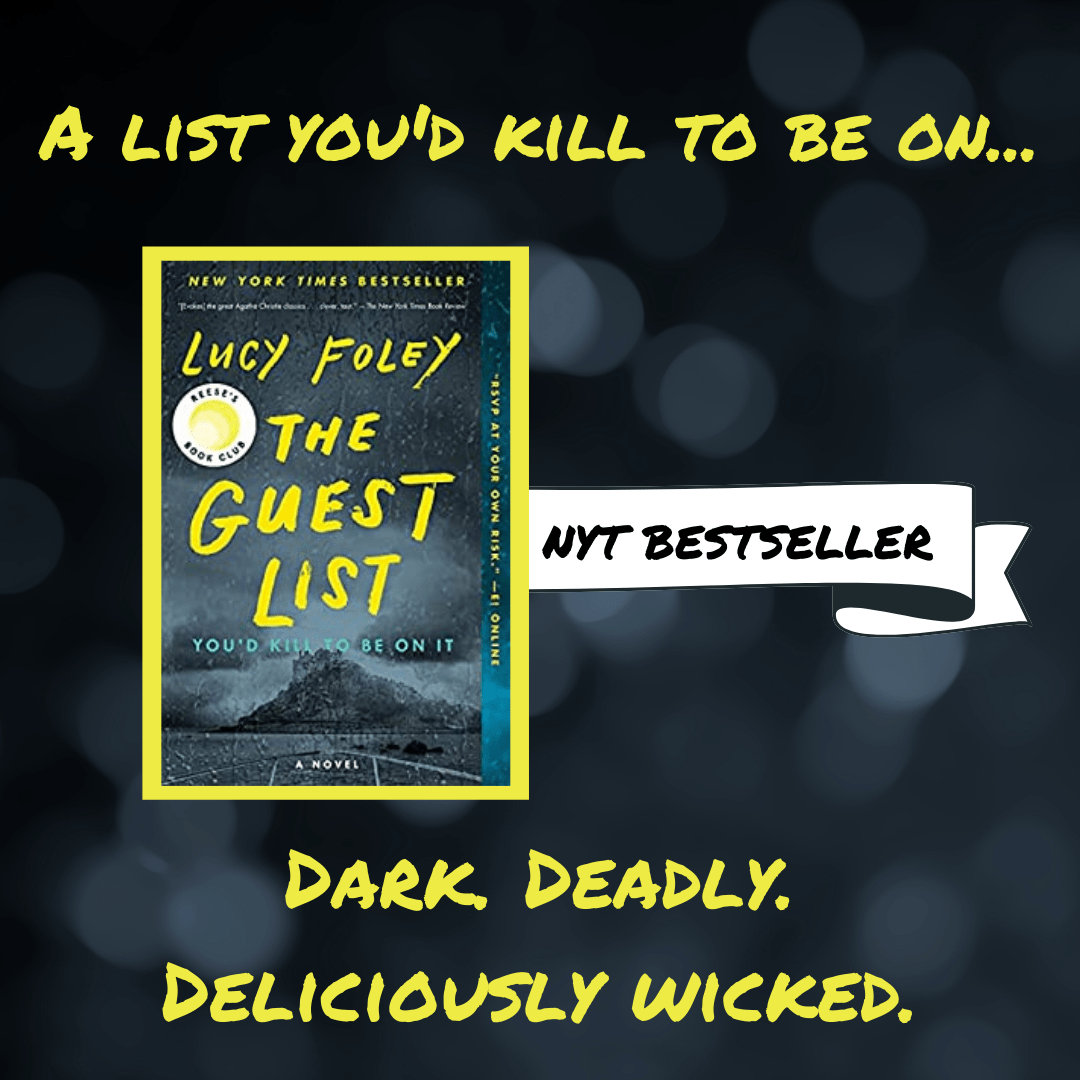
For our sample Facebook Ad in the Mystery genre, you can see that we’re featuring Lucy Foley’s book. What makes this image successful is that the book cover is front and center. Readers can take a glance at this Ad and get a sense of what the topic is. For this reason, having a beautiful and relevant book cover is particularly important.
As for the color scheme of this Ad, you’ll see that the yellow pops nicely against the dark background to draw readers’ eyes.
A word of warning: Be careful with bright text colors like yellow or orange. You want to make sure they’re balanced against a dark background so they’re easier to read.
Lastly, we included descriptor text at the bottom of the ad that will lure readers in. “Dark. Deadly. Deliciously wicked.” This provides readers with a brief idea of what the book is all about but doesn’t give too much away.
Outside of the image portion of a Facebook Ad, there is primary text, a headline, and a description that will need to be added (check out more info here.) For this, our Ad’s primary text could continue to describe themes of the book. In the headline, we could announce any reader incentives that make this Ad particularly attractive – like the book being free on Kindle Unlimited.
Romance Facebook Ad Image

In the image for Jane Igharo’s book, we used Canva Pro’s mockup feature to display this cover on top of what looks like an actual book. Doing so gives the effect of the book being out in the real world.
A helpful tip: High-quality images will always perform best on Facebook. Whether you favor pre-made mockups or prefer to DIY, go with what looks most professional.
Some design sites, like BookBrush, have mockup tools that display your cover image on various tablets or book covers. Canva has slightly fewer mockup options than BookBrush, but you can use its “Frames” feature to drag and drop covers onto a tablet or book as we’ve done in this example.
You’ll see that our image for Igharo’s book leads with a review. The quote announces that this is a “Lovely story about finding family and love.” What we loved about this quote is that it captures the book’s themes in very few words. Too much text in an Ad can be headache-inducing!
Lastly, check out our “Free on K.U.” sticker. You may notice that your eye is immediately drawn to the yellow image. Yellow or red works well for these types of stickers because they catch the eye. Readers love a deal, so be sure to put any special offers you have front and center on Ads.
Science Fiction Facebook Ad Image
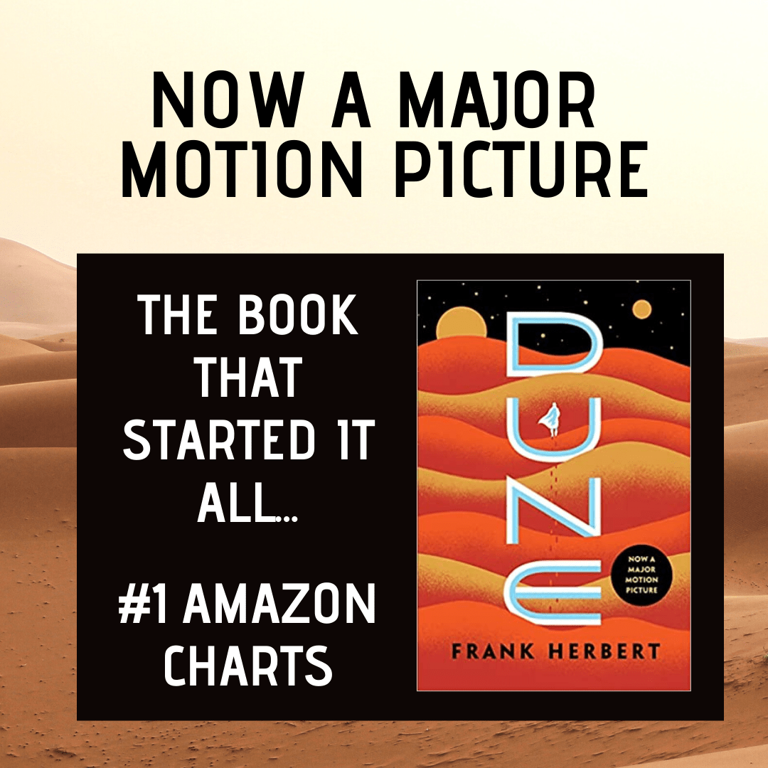
For our Sci-Fi Ad example, we had to go with a classic. Since this book is tremendously popular and the movie has recently been released, it’s easy to have several “value offerings” to show readers in the Ad:
- “Now a major motion picture” – This shows readers that the book is so popular, it’s gone Hollywood.
- “The book that started it all” – Dune is book 1 of 6. We can show readers that if you like Dune, there’s way more where that came from!
- “#1 Amazon Charts” – This is even more proof of legitimacy that people really like reading this book. Think creatively about what you can show off in your own Facebook Ad. A number of high ratings? A perfect 5 star average on reviews? Get it in the Ad!
Though the design of this Ad is simple, both the font and background fit with the cover. Ensure that every detail of your Ad is on-genre or you run the risk of confusing readers. For example, you wouldn’t want curlicue cursive font for a Horror book’s Ad.
Fantasy/Paranormal Facebook Ad Image
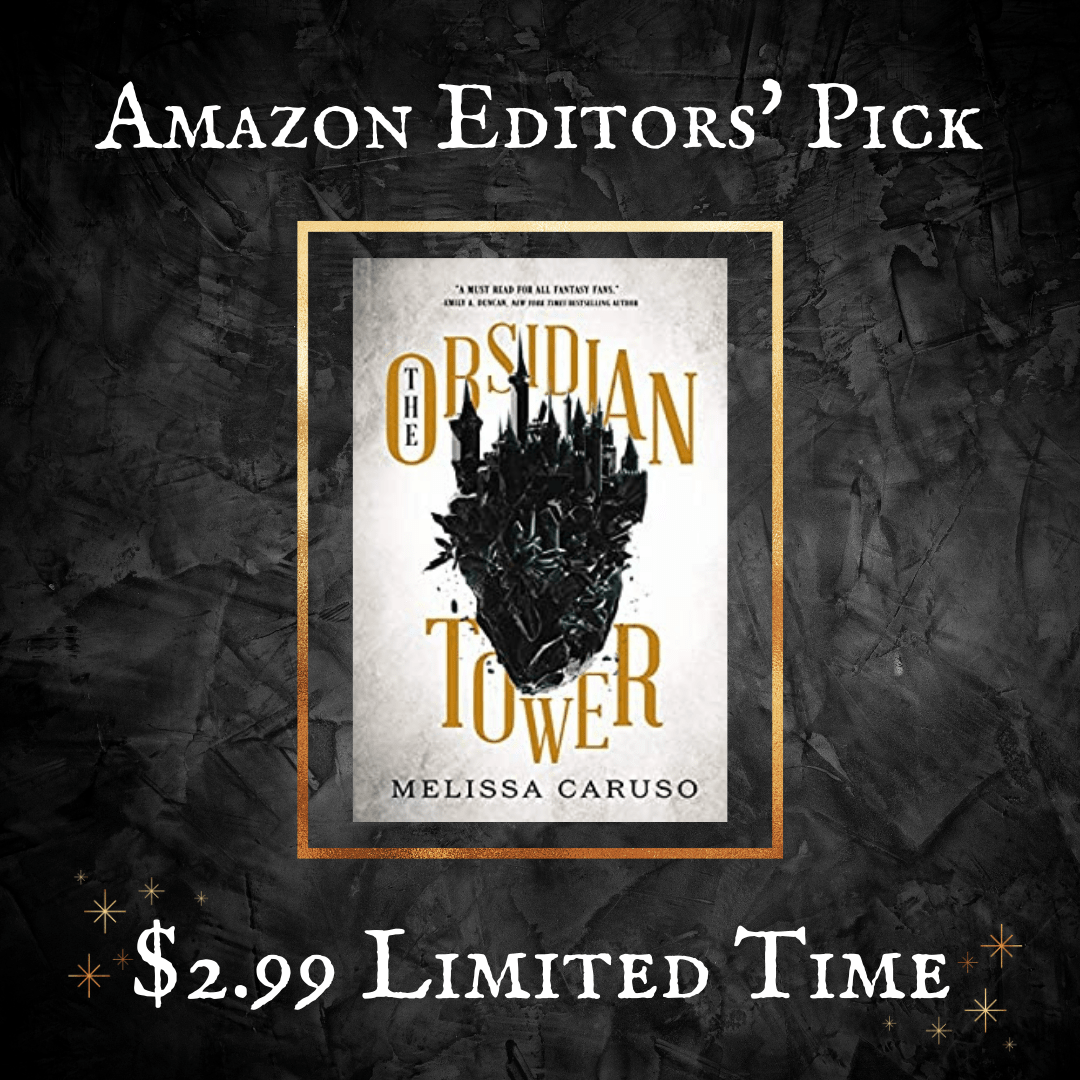
As we’ve shown in our previous Ads, putting limited time language within your image is just as important as including it in supporting text. This particular example is a pretty simple design – it focuses on:
- Establishing legitimacy
- A deal offering
Not only do we shout out that this book is an Amazon Editors’ Pick, but we draw attention to the $2.99 limited-time pricing.
A note: If you’re running an Ad on a time-specific deal, be sure to close your Ad when the deal has passed! You don’t want your Ads to be misleading.
You’ll also see that this Ad uses a font that plays well with the Fantasy/Paranormal genre. Similar to our Sci-Fi Ad, we were careful to pick design elements that remain on-genre. If you’re interested in checking out a list of suggested fonts for book covers (or Ads!), this website is a great place to start.
Literary Fiction Facebook Ad Image
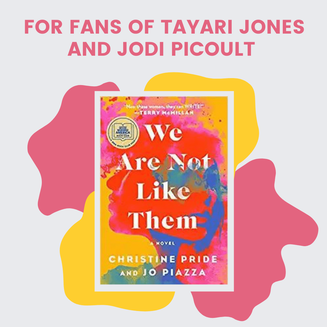
Our last Ad gets a bit more experimental out of the ones we’ve previously displayed; here, you can see that we kept the text short and sweet. Instead, we let the book cover and its eye-catching colors speak for themselves.
When we created the design for this ad, we chose elements (those pink and yellow shapes behind the book) whose colors could be changed. The great thing about Canva is that you can match colors with whatever book cover you’ve added to a specific project:
As we’ve said, it’s important to keep your ads on-genre… but it also helps to keep a consistent feel to them. You can do this by using font or design colors that match the colors on your book cover.
Aside from design, a helpful way to get readers’ attention in an Ad is by playing up personalized or tailored language. In this case, we used “For fans of…” to call out two highly popular authors whose styles are similar to Christine Pride and Jo Piazza. Supporting text, like the headline or description of your Ad, is also a great place to apply this strategy.
Wrapping Up: Facebook Ad Images for Authors
So what do you think? Did our example images catch your eye? If so, you can follow this link to work directly off the templates listed in this article. Simply upload your book covers to your Canva account and pull them over to the frames included in each sample image. From there, you can personalize the text or design elements.
Psssst… It’s worth noting that we did create these Ads using Canva Pro. Some of the same elements may not show up for you if you have a free account.
The beauty of Facebook Ads is that they’re highly effective. In 2015, a study showed that Facebook influences more than half of shoppers’ off- and online purchases. There’s clearly proof in the pudding! Unfortunately, Facebook Ads can be time time-consuming to create, launch, and monitor.
If you’d like to utilize Facebook Ads but have someone else do all the heavy lifting, we’re here to help. Check out our Reader Reach page to learn how we can serve as your Facebook Ad agency – without the price tag.
How come none of these ads have a CTA (call to action) in them? Shouldn’t you include a hyperlink so the reader can be taken to the sell page for the book with just a mouse click?
Hey Raoul,
Great point! Every ad should have a direct CTA, but in this post we are simply offering ideas on the image portion of a Facebook ad. When you run ads on facebook, there will be accompanying text that should include a CTA, and the image it self will also link to where the ad manager (you) directs.