
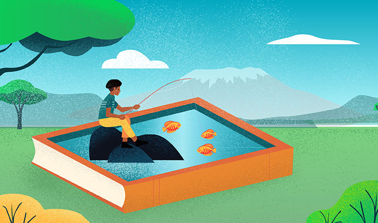
Designing a great-looking book cover is no easy feat, which is why many designers end up making the same common mistakes. A successful cover is not only eye-catching, but it also represents the book’s theme(s), meets genre expectations, and 一 more importantly 一 leads to sales.
As cover designers continue to experiment with classic and original designs, new and old trends emerge and consolidate, reflecting what the audience likes best at any particular time. Some trends stay relevant for decades, others cyclically come and go, and some have a brief moment before they quickly fade away.
In this article, we’ll look at 5 cover design trends that are currently in vogue, and that hopefully can inspire you to create a best-selling cover for your next book.
- Symbolic and vibrant flower motifs
Flowers, flowers everywhere! In case you didn’t notice, floral book covers are one of the hottest trends right now, especially as we’re moving towards summer in the northern hemisphere. There is something about them that makes it a compelling choice for many designers.
For starters, many people find flowers visually pleasing and have positive associations with them. Flowers can also keep the design fresh and clean, and is a natural way of inserting bold colors without drawing too much attention or feeling out of place. More importantly, flowers are deeply symbolic: historically, different flowers have represented a wide variety of themes, from youth to death, beauty, femininity, elegance, and so on.
This versatility of interpretation keeps the reader guessing if and how they’re related to the story. It also means that floral book covers are versatile and can fit into different genres, from mystery to romance to YA novels. For all these reasons, flowery covers have been happily embraced by big book publishers and indie presses alike, and the trend might continue to blossom.
- Abstract color blends that pop on social media
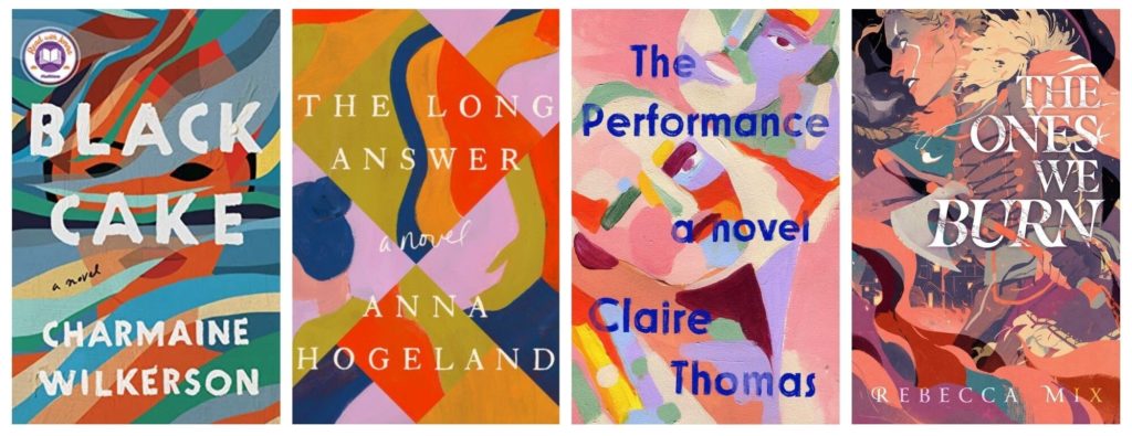
A few years ago, you couldn’t enter a book shop without noticing strikingly colorful, book covers with abstract compositions revealing characters or elements present in the book 一 like the one of The Vanishing Half by Brit Bennett 一 which still has the bookish community in a chokehold.
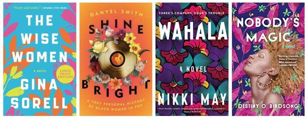
Sometimes the shapes and colors are mixed to subtly reveal a facial silhouette, like in the case of Black Cake by Charmaine Wilkerson or The Performance by Clair Thomas. Other times the images are sharper, like the heroine on the cover of Rebecca Mix’s YA fantasy fiction, The Ones We Burn, masterfully blended with the flames, houses, and the book title.
Unlike clean designs defined by simple typography and predictable patterns, this approach favors texture, organic color blends, and hand-traced typography for a dynamic visual effect. In a way, it says no to perfection, suggesting a nuanced story with multi-faceted characters.
The vivid colors make these types of books highly “Instagrammable” and cool to share 一 perhaps near a cup of tea, a plant, or out in nature 一 which helps with marketing and visibility. Importantly, this style makes the book stand out both in physical stores and on the flat web pages of online retailers. In fact, no matter how many Amazon ads authors buy to grow their sales, an eye-catching design is an absolute must to perform well on the platform.
- Illustrations that let the imagination run wild
Colorful, flat, cartoonish illustrations are making a strong appearance on book covers these days, especially in the romance and contemporary fiction genres.
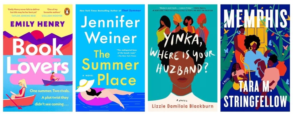
These types of illustrations give designers a way to represent a character and world setting without giving away too many details, therefore leaving plenty of room for the reader’s imagination. This is achieved, for example, through a feature-less portrait on the cover of Yinka, Where Is Your Huzband? by Blackburn, or by concealing a lady’s face with a sunhat, on the cover of The Summer Place by Weiner.
It’s a trend that particularly suits “feel-good novels”, inspiring positive emotions and hinting at a refreshing, engaging, and relatable story that could happen to anyone 一 like those sometimes inspired by short story prompts.
- Minimalism and simplicity continue to shine
Minimalist design has been trending for decades and it continues to be one of publishers’ favorite picks, especially for non-fiction books. As opposed to maximalism, which fills every corner of the cover with details, a minimalist design aims to represent a book’s core idea with a single image, drawing, or stylistic effect.
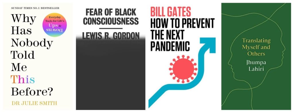
Minimalist covers are easier to digest at a glance. Take Translating Myself and Others by Pulitzer Prize-winning author Jhumpa Lahiri: a couple of lines draw two overlapping profiles, looking in opposite directions, playing with the book’s theme of communicating in different languages.
Similarly, Bill Gates’ new book How To Prevent The Next Pandemic communicates the book’s core idea with a simple arrow circumnavigating the symbol of a virus, while Fear of Black Consciousness by Lewis R. Gordon plays with the color black to represent the fear underlying the discussions about race.
In a world where we are constantly bombarded with sensory inputs, it looks like there will always be a place for minimalist design and its ability to say more with less.
- 100% typographic covers that demand attention

Fully typographic covers are one of those trends that were popular years ago and have recently made their way back to our bookstores. These types of covers focus on the title of the book with a clear, unapologetic, and visually appealing font that reflects the tone of the book.
This type of cover design is particularly effective for books that deal with difficult, socially relevant conversations 一 like His Name is George Floyd by Samuels and Olorunnipa or The Transgender Issue by Shon Faye. Chances are that if you’ve been touched by these controversial topics, you’ll get the book in your hands once you read the title. However, the design can fit other genres too, like contemporary fiction and historical non-fiction to name a few.
It’s also an opportunity for the designers to play with typography, the balance and the dimensions of the composition, like on the cover of Joan is Okay, with the letter A turned upside down, suggesting that maybe Joan isn’t okay after all — at least not in a conventional way.
The strength of these covers comes from being so “in your face” that they demand your attention. In a way, you can’t help but look at them, and 一 most likely 一 remember them.
–
As our society and culture continue to change, so does the way people discover, read, and share books. New and old trends around book cover design will continue to overlap, balancing the tension between great art and good marketing 一 hopefully managing to combine both. I, for one, am excited about what new trends will hit the bookshelves in the years to come.
Dario Villirilli is a writer with Reedsy, a marketplace that connects authors with self-publishing resources and professionals like editors, designers, and ghostwriters.
Sorry They are all ugly. 4 and 5 look the same and 2 and 3 are pretty close as well
Thanks for this post. Cover art has baffled me for the last few years. I look at your #2 “Abstract color blends…” assortment, and I agree this is a type of cover graphic that is very common now, but it flies in the face of reason. When you can barely read the title and the explosion of color and designs are so compacted, every cover “feels” the same, and the title is completely lost from memory. Being a writer and an analyst professionally, I want to see data backing up decisions, especially marketing decisions. Have there been any true, analytical studies linking cover designs to sales? It just seems like it’s more a fad than a data-backed marketing decision. Thanks so much for presenting these ideas for our consideration!
Those covers in #2 are totally useless for ebooks or authors who sell online. You can’t even read the poor titles’ color choice at this size… much less a thumbnail on amazon.
Great post. Gave me a few ideas. Thank you for creating and sharing.
So ugly is a trend?
Hard to read is a trend?
These covers are so tiresome with all the visual noise